Controlling Table Sizes in HTML5: A Comprehensive Guide with Examples

Introduction
Tables are a fundamental component of web design used to present data in a structured and organized format. HTML5 provides various ways to control the size of tables, columns, and cells, allowing web developers to create visually appealing and well-organized data displays. In this article, we will explore HTML5 table sizing, its significance, and provide real-world examples to illustrate its use.
Understanding HTML5 Table Sizes
HTML5 tables consist of several key elements, including <table>, <thead>, <tbody>, <tr>, <th>, and <td>. The size of these elements can be controlled using HTML attributes and CSS properties.
HTML Attributes for Table Size
- Width: The
widthattribute in the<table>element sets the width of the entire table. You can specify the width in pixels, percentages, or other length units. - Colspan and Rowspan: The
colspanandrowspanattributes in<th>and<td>elements control the width and height of cells by merging adjacent cells.
CSS Properties for Table Size
- width and height: The
widthandheightCSS properties can be used to set the dimensions of the table, columns, or cells. - max-width and max-height: The
max-widthandmax-heightCSS properties can restrict the maximum width and height of tables or cells, preventing overflow. - table-layout: The
table-layoutCSS property determines how the table layout algorithm should be applied. It can be set toauto(default) orfixed.
Example of Controlling Table Size

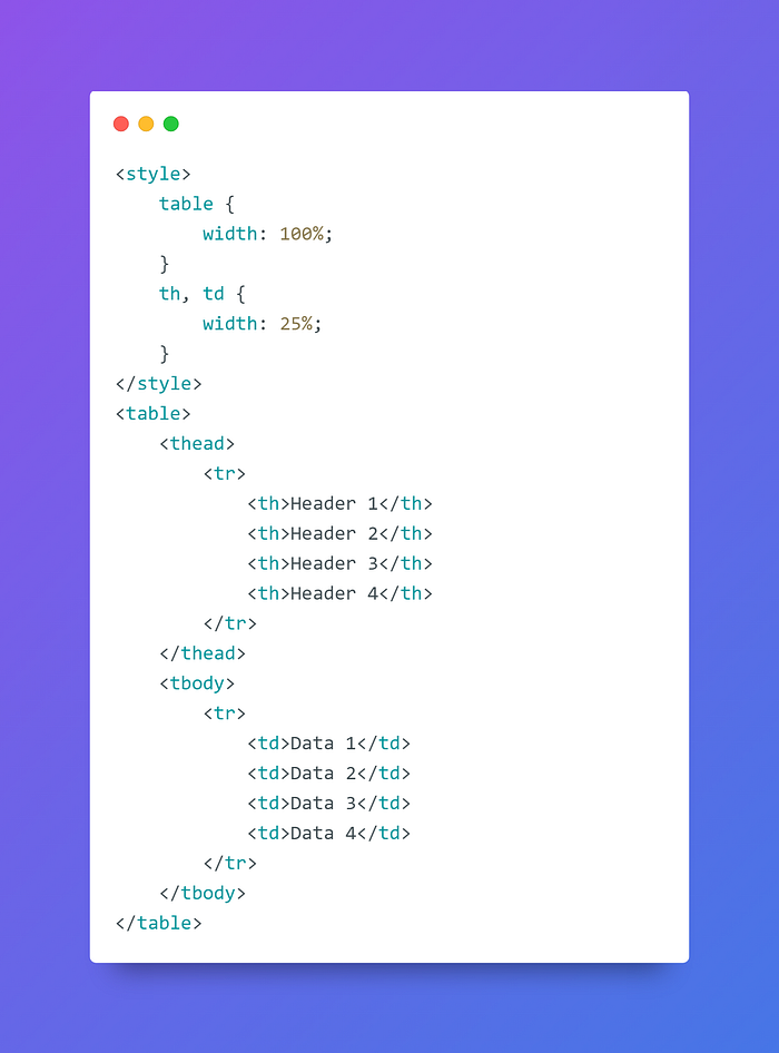
In this example, we’re using CSS to set the width of the entire table to 100% and the width of each column (header and data cells) to 25%.
HTML5 Table Size Examples
Let’s explore practical examples of controlling table sizes in HTML5 for different use cases.
Responsive Table

In this example, the table width is set to 100%, making it responsive and adapt to different screen sizes.
Fixed-Width Table

In this example, the table has a fixed width of 400 pixels.
Maximum Table Width

In this example, the table’s maximum width is set to 600 pixels, preventing it from expanding beyond that size.
Best Practices for HTML5 Table Sizes
To make the most of HTML5 table sizes, consider the following best practices:
- Responsive Design: Use percentage-based widths to make your tables responsive and adapt to different screen sizes.
- Fixed-Width Tables: Consider using fixed-width tables when you need precise control over table dimensions.
- Column Width: Set column widths for data consistency and readability.
- Max Width: Utilize the
max-widthproperty to prevent tables from becoming too wide, especially on larger screens. - Testing: Test your table sizes on various devices and browsers to ensure they display correctly and provide a positive user experience.
Conclusion
HTML5 provides various methods for controlling and styling table sizes, allowing web developers to create tables that are responsive, fixed-width, or have maximum dimensions. By understanding how to use HTML attributes and CSS properties for table sizing, you can create tables that effectively present data while enhancing the visual appeal and user experience of your web content. Mastering HTML5 table sizes is a valuable skill for web developers looking to create well-structured and visually appealing tables.
Thank you for reading this blog post!
I wish you all the best in your endeavors and hope you found this information helpful.
