Crafting User-Friendly Experiences: A Guide to Responsive Web Design in HTML5

Introduction
Responsive web design has become a fundamental approach in modern web development. With the proliferation of various devices and screen sizes, ensuring that your website looks and functions well on all of them is essential. In this article, we will explore the principles of responsive web design in HTML5, provide practical examples, and discuss the best practices to create user-friendly, responsive websites.
The Need for Responsive Web Design
The rise of smartphones, tablets, and a variety of screen sizes has made responsive web design a critical aspect of web development. Responsive design ensures that your website adapts to different screen sizes and orientations, providing a seamless user experience. HTML5, with its structural and semantic elements, is a powerful tool for achieving this.
Key Principles of Responsive Web Design
- Fluid Grids: Use relative units like percentages to create flexible grid layouts that adapt to various screen sizes.
- Flexible Images: Ensure images scale proportionally to their container, preventing distortion.
- Media Queries: Implement media queries in CSS to apply specific styles based on screen size and device characteristics.
- Mobile-First: Start designing for mobile screens and gradually enhance the layout for larger screens, ensuring a consistent user experience.
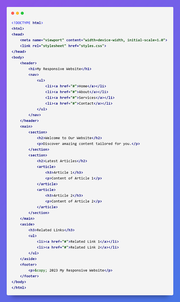
- Viewport Meta Tag: Set the viewport meta tag in the
<head>section of your HTML to control how the website is displayed on mobile devices.

HTML5 Structural Elements for Responsive Design
HTML5 introduces structural elements that play a significant role in creating responsive web designs. Here are some of these elements:
1. <header>
The <header> element is often used to contain the site's branding, primary navigation, and essential content. It provides a top-level container for your website's header section.
2. <nav>
The <nav> element defines a navigation menu, which can be used for primary or secondary navigation. It helps organize your navigation items.
3. <main>
The <main> element contains the primary content of your webpage. It should be unique and present on every page.
4. <section>
The <section> element is a container for grouping related content. It enhances the structure and semantics of your web page.
5. <article>
The <article> element represents a self-contained piece of content, such as a blog post, news article, or product listing.
6. <aside>
The <aside> element is used for content that is tangentially related to the main content, like sidebars or advertisements.
7. <footer>
The <footer> element encapsulates the bottom section of your web page and often contains copyright information, links to terms and policies, and other footer content.
Responsive Web Design Example

Best Practices for Responsive Web Design
- Mobile-First Approach: Start with mobile design and progressively enhance for larger screens. This ensures a strong mobile user experience.
- Use Relative Units: Utilize percentages and ems for font sizes, margins, and paddings to ensure content scales smoothly.
- Test on Various Devices: Regularly test your website on different devices and browsers to verify its responsiveness.
- Optimize Images: Use responsive images and implement lazy loading to enhance performance.
- Content Priority: Place the most critical content near the top of the page to ensure it’s visible on smaller screens without excessive scrolling.
- Accessibility: Ensure your website is accessible to all users, including those with disabilities, by following best practices for web accessibility.
Conclusion
Responsive web design is essential for delivering a consistent and user-friendly experience across various devices and screen sizes. HTML5’s structural elements, combined with CSS and responsive design principles, empower web developers to create flexible and visually appealing websites. By following best practices, you can craft responsive web experiences that cater to the diverse needs of your audience, ensuring your content reaches and engages users on any device. Mastering the art of responsive web design is a key skill for modern web developers.
Happy Coding !
Thank you for reading this blog post!
I wish you all the best in your endeavors and hope you found this information helpful.
